Blog Redesign
I have redesigned my blog recently. Well, not really redesigned, rather applied a Hugo theme, that I liked the most.
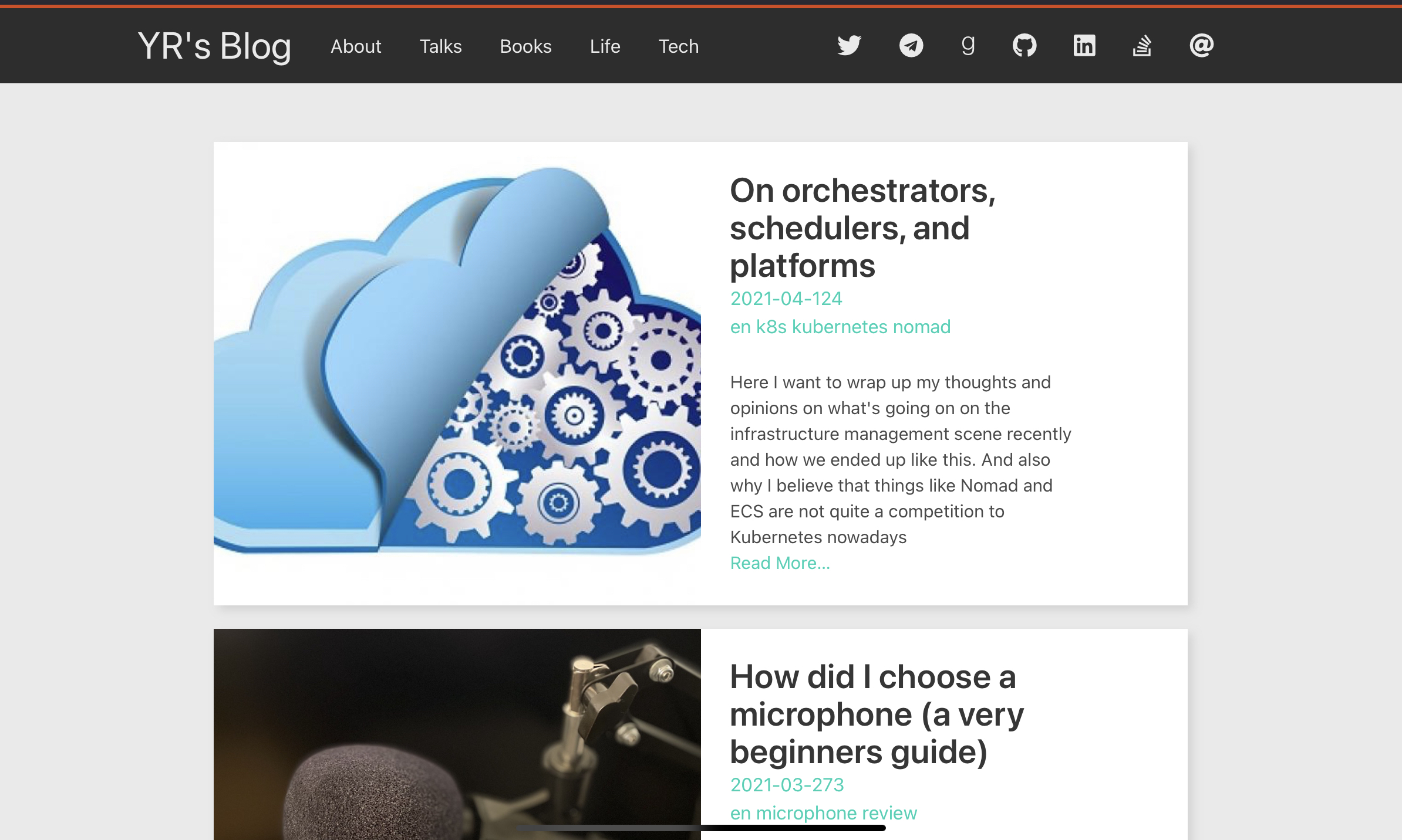
This is how it was before:
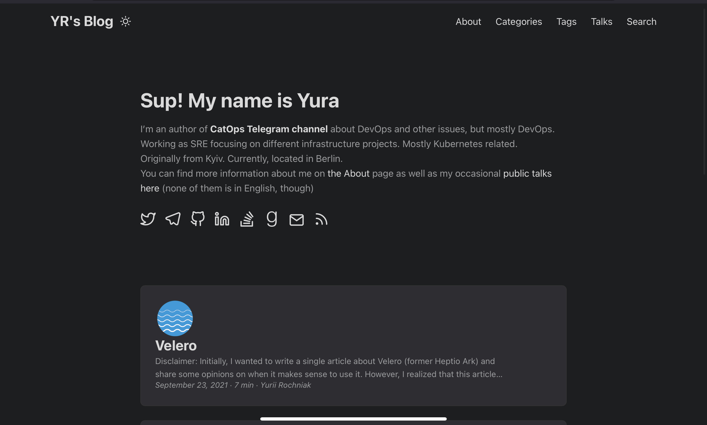
And this is how it looks now:
Why so?
Supporting a theme is hard. I’m not a web developer. I have some idea about CSS and I can use a bunch of examples on the Web to create something on my own, but it takes a lot of effort. And this is not the effort I would like to put.
I’ve inherited the previous theme from a random guy on the Internet. I found this theme just like I found the current one. I changed a lot of things back then. At some point, I made those changes less horrible and decided to contribute back and… Found that the original repository is archived. So, I had no choice but just leave it on GitHub. Feel free to fork it on your own, since I’m not very interested in developing it further.
Yet, here are a few things that I wanted to update:
- Create a static “brief about” on the home page, like the one on the up-to-date site.
- Implement a light vs dark theme.
- Twitter cards and a pretty link preview in general.
- Some minor tweaks. For example, code blocks in the old version had weird line spacing.
The first thing sounds not that complicated. I even started some work there. Unfortunately, it didn’t work well on all the screen dimensions. And then I didn’t have time to update CSS for it. And then I abandoned it :
The second task is not that trivial! I would have needed to create a brand new color palette for the dark version and this was the point I gave up.
Public Themes for the Rescue!
As you can imagine there are plenty of themes for Hugo available over the Internet. I didn’t even dare to search on GitHub, because there are too many of them. I used Hugo Themes Free website, which has a pretty verbose name, I must say. The one thing I liked the most about a dedicated website is that you can see a screenshot right away. It simplifies search a lot.
My goal was to find a theme I like and deliberately withhold myself from any tweaks. I want to configure it once and leave it as is for a couple of years. If anything changes about that theme - fine, I’ll pick it up from the upstream. Otherwise, I don’t want to bother.
The main downside of public themes is that sometimes you need minor tweaks which are just not there. This is why I forked my original theme in the first place. Luckily, we are not that unique. If I need something, there is a high chance someone else needs that too!
Thus, I found a fork that fixes image rendering a bit and makes this public theme shine! I use Daniel F. Dickinson’s fork of the popular PaperMod theme for Hugo.
I also looked into this Card style theme. However, the rendering of single pages looks neater on the PaperMod. Although, I must admit that “Card Style” looks like a more mature website. It has dynamic image cropping, thumbnail preview out of the box, widgets, etc.
What About the Content?
Right. You could argue that visual appearance is not the main thing for a personal blog and I totally agree here. However, I would like to have something pleasing for myself in the first place. Those minor things like weird line spacing and no welcome text were distracting my attention from the main purpose of the blog - it’s content!
Instead of focusing on content creation, I was thinking about when to get some time to fix all those odds. The results were not productive.
Hence, I want to stick with this minimalistic theme for a bit and focus on the content eventually. I still have some unpublished drafts that I need to finish. Also, now I know that with public Hugo themes a redesign takes a few hours. And most of this time goes to decide which theme to use. So, not when I’m less concerned about the visual appearance of my blog, wish me good luck publishing new stuff here!